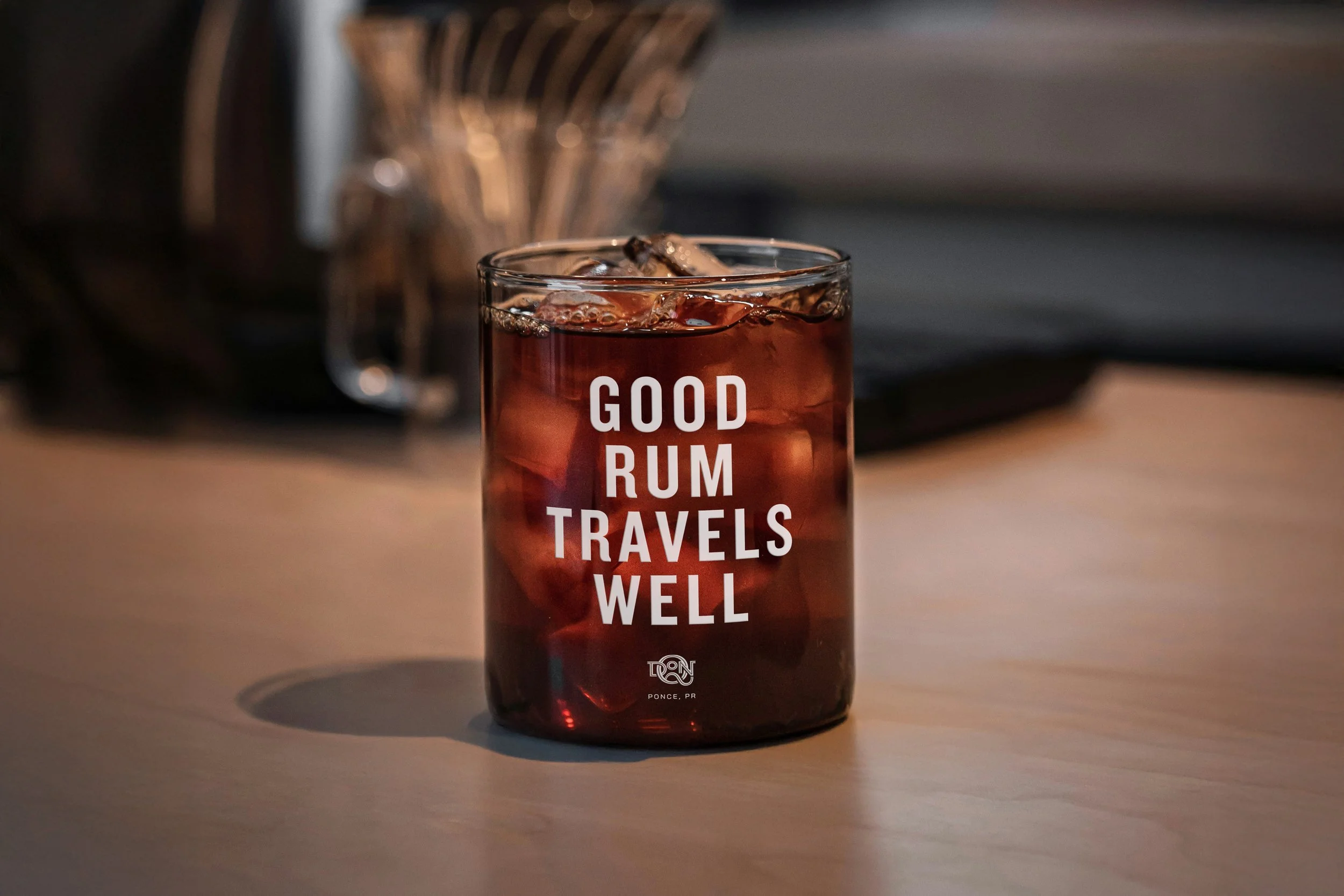
DON Q RUM REBRAND
BRANDING | PACKAGING | LOGO DESIGN
The rebrand of Don Q rum centers on highlighting its Puerto Rican heritage while drawing attention to the ongoing economic impact of the Jones Act.
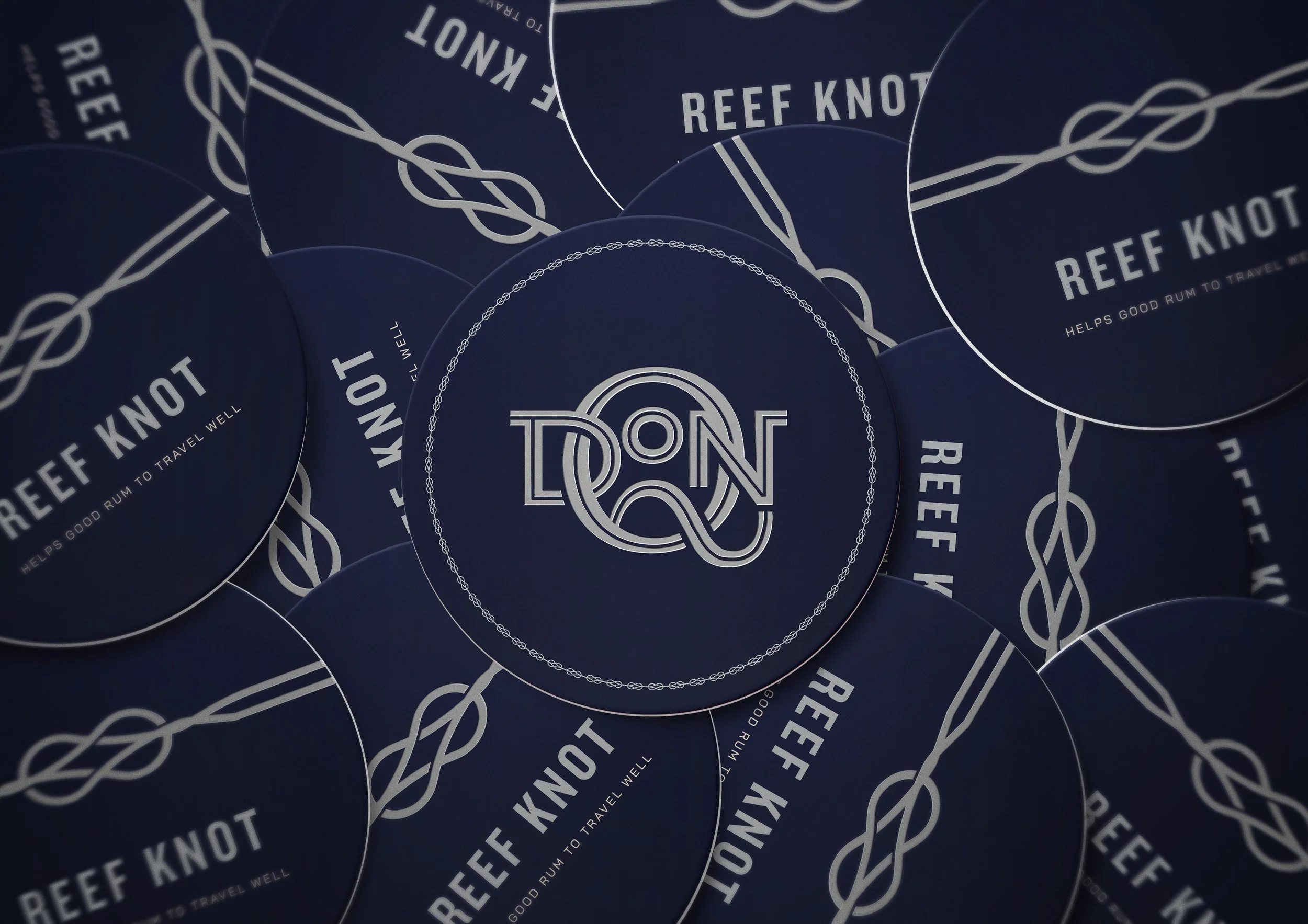
A nautical visual identity anchors the branding, reflecting Puerto Rico as an island and acknowledging the historical role of maritime routes in rum trade. The graphic language incorporates rope knots traditionally used on ships, serving as a symbolic representation of restriction, mirroring the limitations imposed on Puerto Rico through the Jones Act.

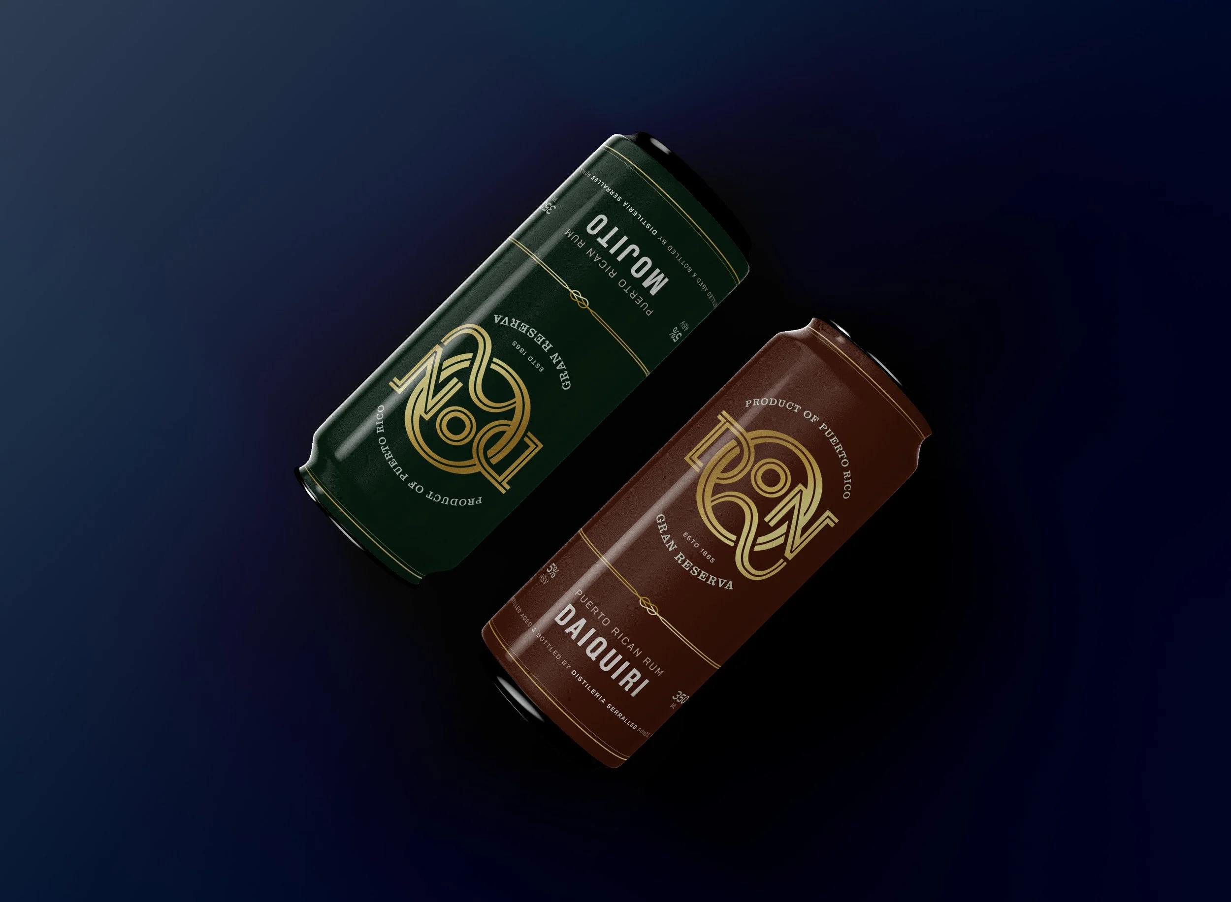
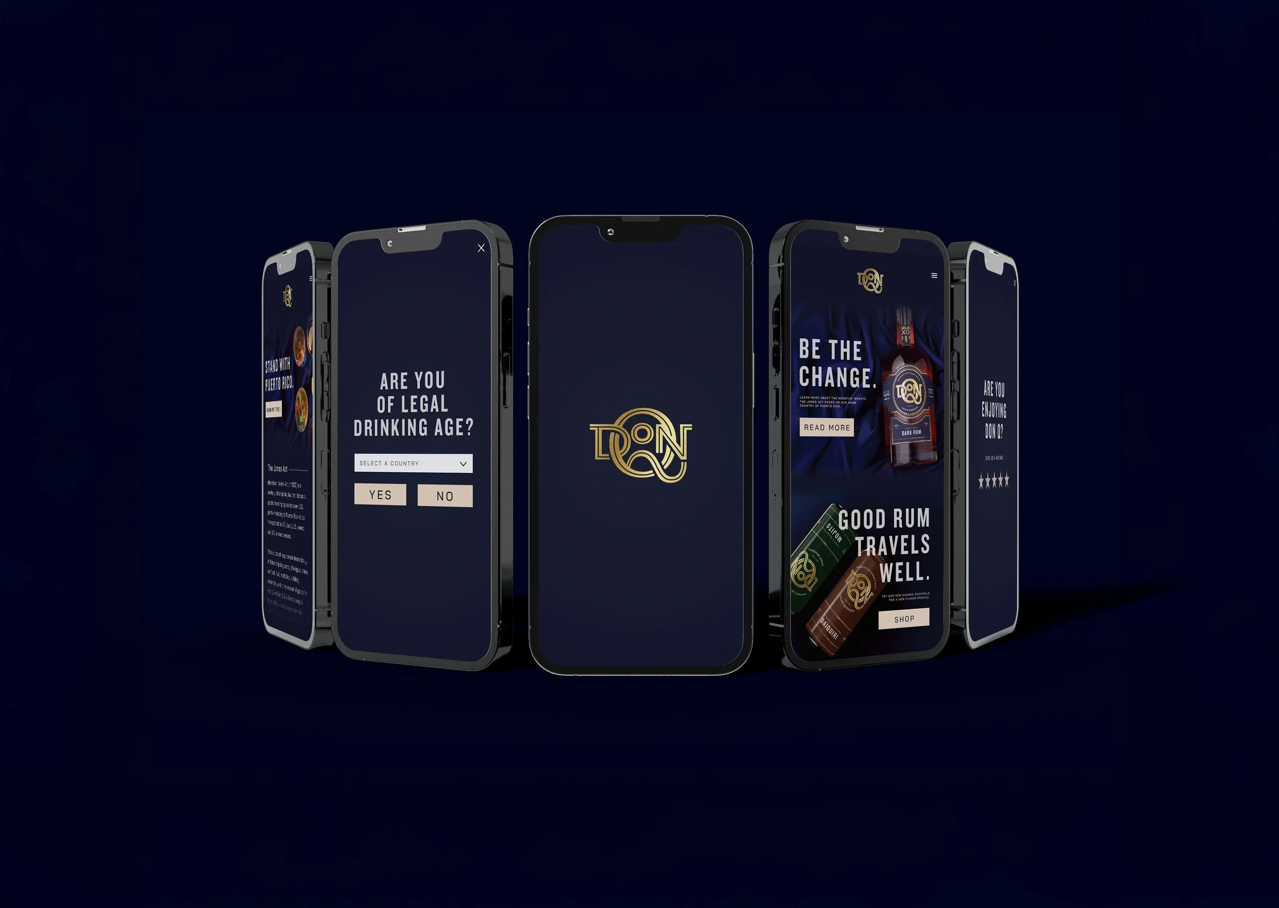
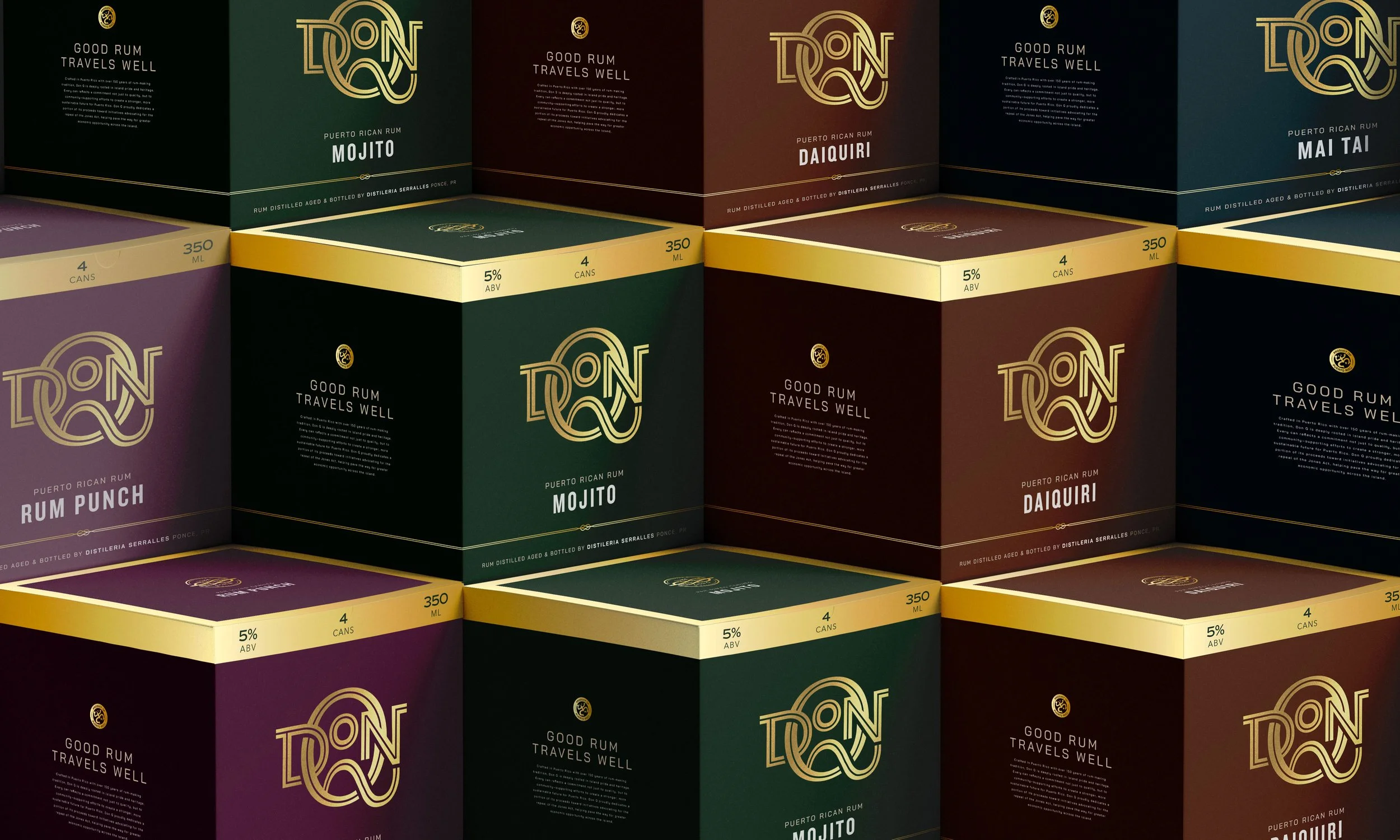
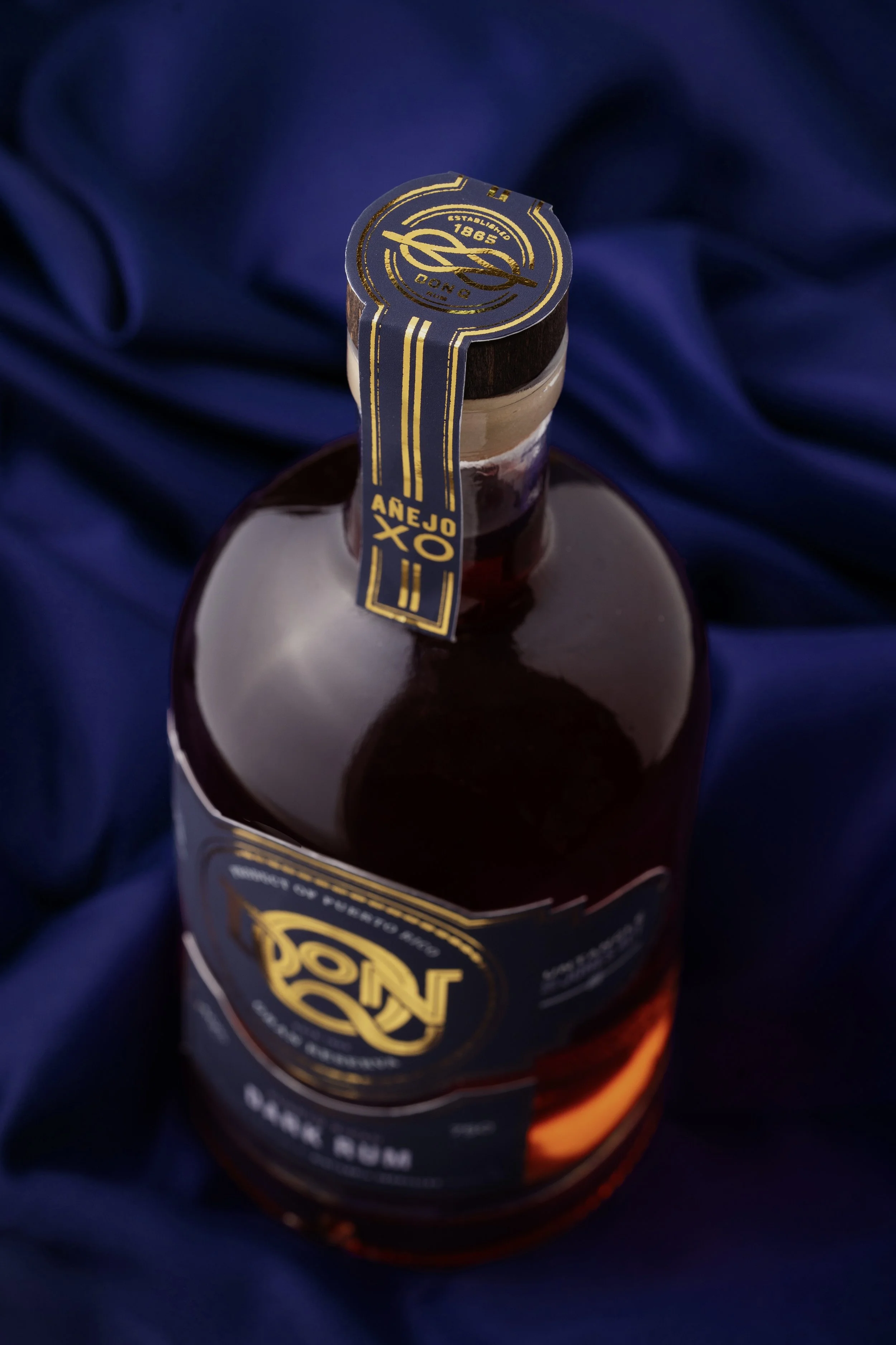
This phase also opened the door to collaborating with a professional product photographer, an experience that added a lot to the final outcome. The photoshoot was art directed to make sure everything stayed true to the brand’s look and feel, from lighting to composition. It was a chance to really bring the identity to life and see how the visual direction translated into real, tangible imagery.